when I was learning to play poker we had the various hand rankings printed up on each wall so you could just look up to see the order.
This led to an amusing meta where you would see your opponent look at their hand, squint up at the wall and then raise and you knew you were hosed. This then led to bluff glancing at the walls before betting.
My girlfriend has gotten mad about this in the past. I’m like hold the run button then press the jump button. She would get angry and tell me to say which buttons those are. I would really have to think about it, when playing a game I associate a button with the function and forget which button is what.
I can’t remember which game it was (something on the Switch, so maybe a Nintendo game) where the game itself told you which button to press by showing four circles on screen (e.g. next to the speech bubble) and only one of these circles is filled out, so instead of a letter, you know you have to press the right button or whatever… I really like this design choice because it’s so intuitive
Most Nintendo Switch games do this. I think part of why is you might be using a pair of Joy-cons or a Nintendo brand controller with the Nintendo ABXY layout, 3rd party controller with the Xbox ABXY layout, a sideways joycon with ABXY buttons but rotated 90 degrees including the labels, or a sideways joycon with unlabeled buttons.
There’s no way for the game to consistently the way your controller is labeled, but it can know which of the 4 buttons needs to be pressed based on location.
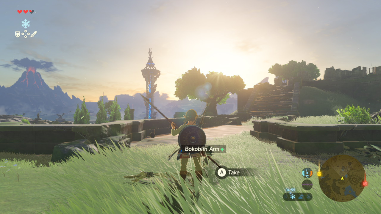
Legend of Zelda?

Oh god, I want to experience this game for the first time again.
I got back into video games again during lockdowns and after leaving a very soul-crushing relationship. It was probably the perfect time in my life to experience BotW.
Have you ever played Shadow of the Collosus? If not, I think it’ll give a lot of the same vibes that you’re looking for.
Oh yes, I love Shadow of the Collosus and Ico! Played them as a child, and played Collosus during lockdowns as well. It really can use a control update, but otherwise the game holds up really well!
I think it’s all the Switch games, or most of them. It’s part of the system font. It’s at least any game that can be played with a single joy-con because the traditional layout doesn’t match the labels in that configuration.
Nintendo is generally good at this part of design. Back in the GameCube days, all the buttons were different shapes, sizes and were easy to tell apart by feel, so they just used icons of the buttons. In the N64 days, X, Y and Z were all triggers in different positions, and the C buttons had arrows on them so you could tell by the icon which was which.
Playing games on pc and getting xbox button hints while using a Playstation or Nintendo controller is a special kind of frustrating. Like anything else, you get used to it, but I think I would like the position based hints you describe a lot better.
Just remap the controller so the letters correspond to the right spot on the controller
Then thé controls become unintuitive. Press the button on the right to jump? Ludicrous.
PlayStation uses different icons though.
Is it just me or has someone gone through and down voted every single comment in here?
Edit: actually every Lemmy world post is showing all comments as having 0 points. Interesting.
There’s either a core contingent of professional haters, or there’s a single simple smarter-than-the-average Lemmy admin bot doing the downvoting, because I swear to god every post that’s on this site for more than a few hours gets at least one downvote.
Why does Nintendo use a backwards button layout?
A better question would be why Microsoft went with a nonstandard layout when they designed the Xbox controller. Nintendo had been using the A-to-the-right layout since 1990.
Where do you feel Playstation is on this
Playstation still basically conforms to a on the right, since O is generally used as a “confirm” button, and X is generally used as a back out button. So, they fill the same role as the conventional layout, they just abstract it in a kind of more fun way.
Playstation games over the years have used X for confirm in many (western) regions. I’m not sure the origin of this but it was always that way growing up.
Circle was used in Japan. Localisations like Final Fantasy using circle were the exceptions to the rule (I guess it was too hard to change it?)
X being confirm for everybody is a relatively recent thing


