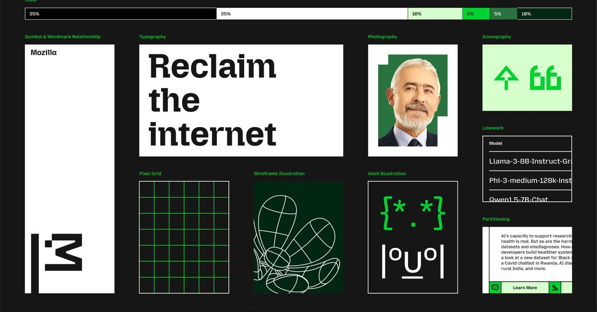
Mozilla has overhauled its branding to pay homage to its Netscape roots and better distinguish the wider organization from its Firefox web browser. The most notable change is to the company’s logo: what was previously a sans-serif wordmark styled as “Moz://a” has been updated to correctly spell out the Mozilla name, featuring a new customized typeface and an M-shaped flag.
According to Mozilla, the flag symbolizes the brand’s “activist spirit.” That fits with the image that the Mozilla Foundation, which is leading the company, is attempting to build: describing itself as “a non-profit organization that promotes openness, innovation, and participation on the Internet” and regularly releasing privacy reports that investigate tech companies’ policy and security practices.
I wonder which ad agency come up with this brilliant hand-washing propaganda after all the shit Mozilla grabbed since the new CEO was in.
Mozilla has become a mockery of its former self, so fair enough. “Activist spirit” my ass.
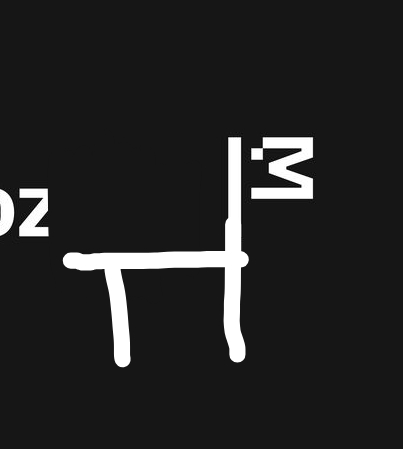
It’s a T-Rex? I always thought the old logo was a play on Godzilla, because the name Mozilla was similar.

Wikipedia says that, yes, it was originally a play on Godzilla, and also green, back when it was still internal to Netscape.
When they started setting up the Mozilla Foundation, a new design was created, of a red T-Rex.
I like the Moz://a branding, altough most people wouldn’t get it, so it makes sense to switch to correct spelling.
Whether the T-Rex is the coreect choice, is another question. I do like that it feels more creative than the basic, reduced logos of today.
Edit: I do like the new Logo. It looks good and it does match its “activist spirit”. Mozilla the corporation is different from the foundation, and I do believe, that Mozilla is closer to its roots than all other browser vendors - including the reskins of Chromium.
deleted by creator
I didn’t know it was chosen not even 10 years ago, as it felt like it could’ve been around for longer.
Yep, that’s what it needed. A new look. Definitely not new management. Just a new look.
deleted by creator
It’s a real shame the process for the previous logo wasn’t followed again. I liked the previous logo, too.
If I ran it I’d rename the dinosaur to T-rexiera
Glad to hear they’re focusing on the really important things.
Goddamn lock ness monsta

Wow, decisions were made with those new fonts. 😬
deleted by creator