Every European (and I guess non-Europeans as well) can vote what our next Euro design will be: https://surveys.ecb.europa.eu/10b/neweuro/
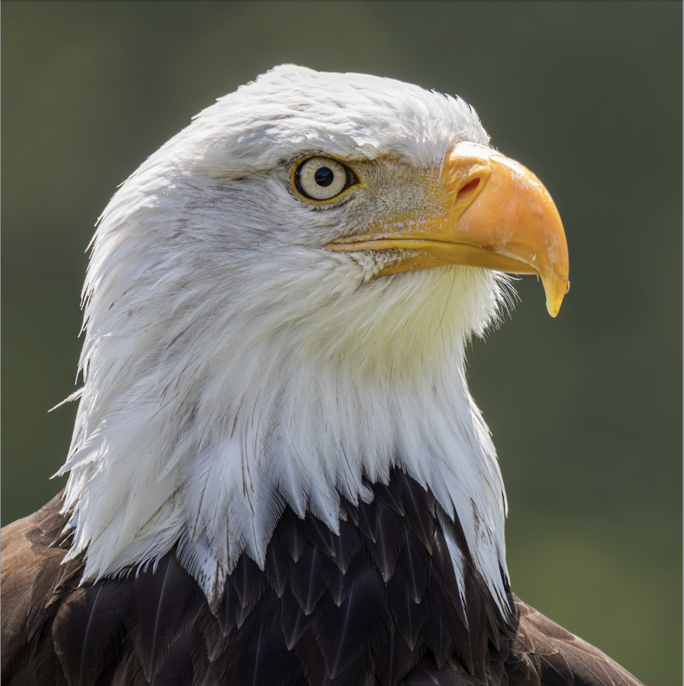
About ten different designs are available and about half of them feature birds instead of boring people.
I really like the bird designs as they symbolise freedom without borders. Hope one of them gets chosen in the end.
Ich_iel had this

Explain the joke plz?
It’s a PET bottle lid that is attached to the bottle so you don’t lose it, a unique piece of their culture I guess lol
And an annoying one. Gets in the way, and makes screwing the cap back on harder because it keeps pulling it.
User error. There’s one extra screwing that people don’t do

Somebody should make a similar one with a tilting window

Does anyone find tilting windows annoying?
skill issue
Im not even that big on birds but the bird designs are so much better than the people ones and also in general i dont think people on banknotes are that good of an idea. Birds on the other hand are something we can all relate to and should think about more cause many species are in danger.
I much prefer the birds over the people =w=
I mean, most of the people on there have 0 relevancy to my country, and I imagine it’s not an uncommon sentiment elsewhere. Birds at least don’t exclude a bunch of countries
I also quite like the vertical/portrait orientation designs in there, I think it would be a cool change
I assume these are in the same order for everyone, but I loved the first set of vertical ones; the ones with might contrast. Most of the designs felt afraid to use color, since the note is supposed to be one color to identify them easily. I honestly think having the high contrast with the birds makes them easier to identify though. 90% of it was still the right color, so that’s still easy to see. Having the image stand out just gives it another identifiable piece though, which can’t hurt, and it makes them look so much prettier.