

2·
4 hours agoAh ok. Everyone makes mistakes, it’s all fine and good :D
Hi, I’m sbird! I like programming and am interested in Physics. I also have a hobby of photography.
previous scheep on lemmy.world: https://lemmy.world/u/scheep
Ah ok. Everyone makes mistakes, it’s all fine and good :D
No, I wasn’t born yet…
later down the line I might add a few more nature deity abilities, but I think four is probably enough.
That makes sense, the Greeks has a bunch more gods and deities and such they worshipped.
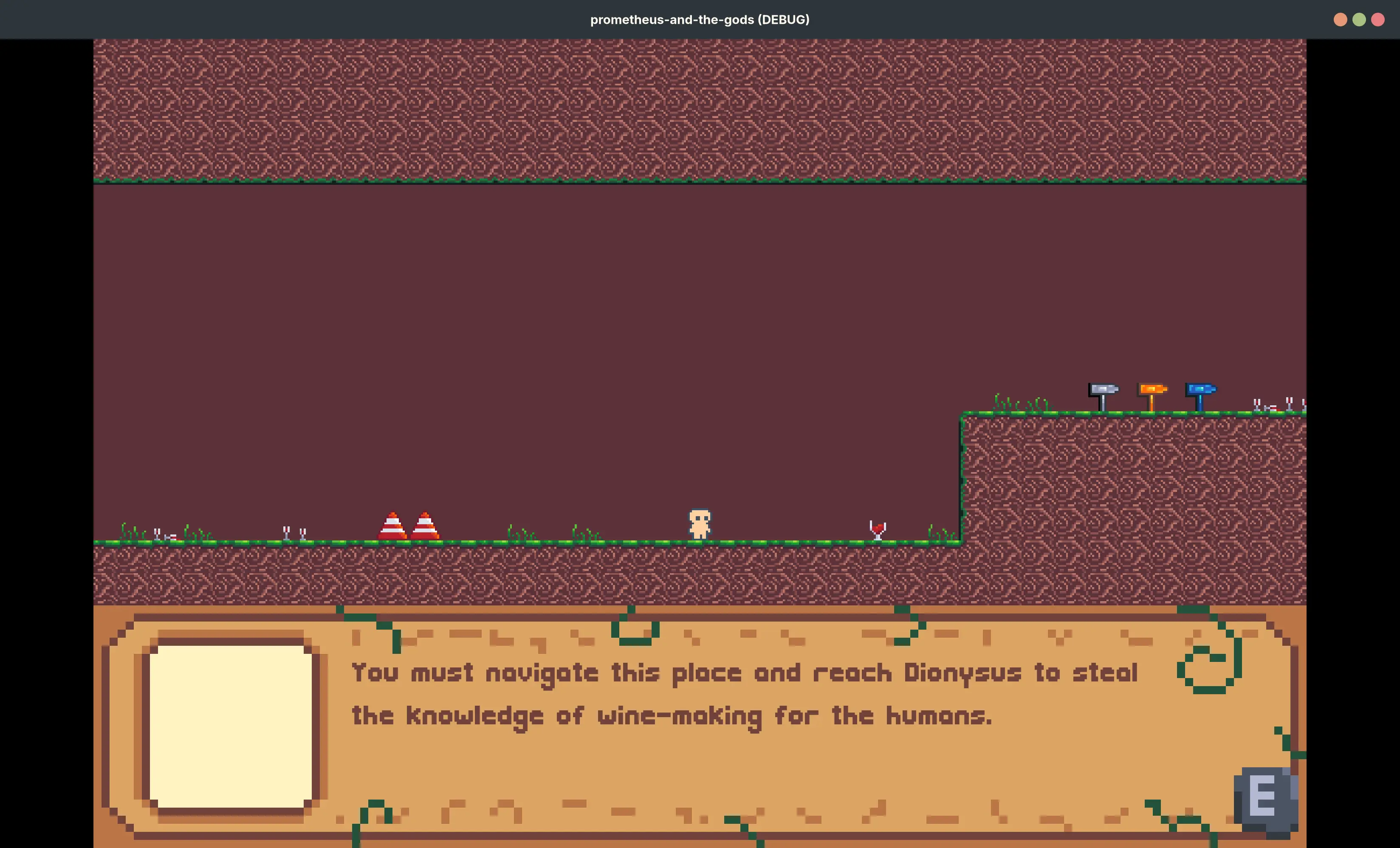
In my game I’m also including four of the nature deities, Helios (the sun god), Achelous (the river god of the Achelous river), the winds, and Gaia (the Earth). The idea is that you can interact with the totems to use their abilities (e.g. Gaia totem would heal you)
that does look really cool! I’ll have to do that at some point…I should probably make the player sprite first though, right now it’s a recoloured version of the one from HeartBeast’s tutorial.
The idea is that you explore each god’s “realm” and at the end there’s some sort of boss fight where you have to knock out the god to steal their “fire” (e.g. mastery of the seas from Poseidon) for the humans
edited to mention it’s the Greek ones and not the Roman ones. Or did I do something else wrong…?
or maybe I could play with some lighting to make it dark and cave-like…

Hiya, I put out the godot project files on codeberg!

they have an e/os version I think

I’m on the beta 2, it’s still hard to read. My background has a very light sky with a dark tree. The buttons seem to adjust for the dark tree, meaning when the buttons are over the light sky (which is in the middle of the screen, where the buttons normally are…) it is unreadable! It’s better when the buttons are over the dark tree (still quite hard to read though), but that’s only when I have half swiped up…

Why are there a bunch of elements with the same symbol? You can’t do that! Also, why do some of them have over 5 letters? It’s either one or two…they are also arbitrarily placed everywhere, maybe each group could be a different genre or topic? I am also bothered by the weird L shape, WHY???
Occasionally, the notifications switch to have a more contrasty background to make it easier to read. But not always. Which is incredibly annoying!
I’m also using the iOS 26 beta, when you swipe down from an app that’s light (e.g. a website) and have a dark lockscreen background then the notifications backgrounds can become unreadable since the lock screen background only appears when you finish the swipe down.
I think it’s fine, with better compatibility with ms office files. LibreOffice is also great and is based in the EU I believe, so if you’re wary of the bear then that’s a great option.
The beauty of linux is there is options!
Different people prefer different things and you can freely choose between all the things!

ublock origin, dark background and light text

I’ve got some lighting now and it looks really cool! No normal maps yet though, so I might get to that at some point…